Disable Highlight

Monday, March 24, 2014

Tableau Use Case : Creating a dashboard for KPIs in a Text Table


Hello.

Today's  use case is that I have a Text Table that has the names of people on the rows and dates on the columns and should be filtered by what activity we're looking at (the documents per hour, number of keystrokes, etc). It should show a shape or color based on thresholds for a particular activity.

The part that I'm having a problem with is creating calculated fields that would accept whatever activity currently selected by the filter and having thresholds for them.


Solution :

Step 1: Create a Parameter as shown below and select show parameter control


Step 2: Create a Calculated Field KPI Values as shown below


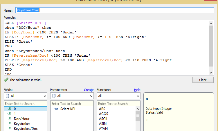
Step 3: Create a Calculated measure Key stroke color as shown below


Now drag the KPI Values to the Label field. , Key Stroke to the Shapes and assign the shapes for KPI as desired.

KPI DOC/Hour


KPI Keystrokes/DOC
keystrokesdoc.PNG.png


The workbook pic


I am attaching the workbook with the solution here , Let me know if you face any problem viewing it.
You may need to change the thresholds based on your requirement , I just picked a random value.

Friday, March 21, 2014

Tableau Use Case : Using a Parameter to control another Parameter


Hi All-

I was wondering if anyone knew how to use a Parameter to control other parameters to filter through data.

For example, I would like to have a primary parameter that would have options in a single values list such as:

1. Top N
2. Bottom N
3. All

If the user selected "All" then all the data would show in the window.

If the user were to select "Top N" I would want them to be able to control the Top "N" (Top 1, 4, 5, 10, etc.) they would like to see on a separate parameter slider control.

If the user selected "Bottom N" then I would want them to be able to control Bottom "N" (Bottom 1, 4, 5, 10, etc.) on a separate parameter slider control.

Here is the Solution with the Workbook attached here.


Wednesday, March 19, 2014

Tableau Tip : How to Calculate Time Difference

Today I was in a situation to calculate time difference between two time fields in Tableau. But Tableau doesn't offers us with any Time Functions . I was able to solve the use case by writing a lengthy Calculated field .

Here is the Logic I Implemented , I Calculated the time difference between both the time stamps in seconds. Later I converted the seconds in to hh:mm:ss format.

The Calculation Logic I used to Calculated time in seconds is

( DATEPART('hour',DATEtime([End time ]))* 3600+ 
DATEPART('minute',DATEtime([End time ]))*60 + 
DATEPART('second',DATEtime([End time ])) ) - ( DATEPART('hour',DATEtime([Start time]))* 3600+ 
DATEPART('minute',DATEtime([Start time]))*60 + 
DATEPART('second',DATEtime([Start time])))


The Calculation Logic I used to Calculated time in seconds

(str(([total time in seconds]- (([total time in seconds]-([total time in seconds]%60))%3600)-([total time in seconds]%60))/3600)+ ":" + str((([total time in seconds]-([total time in seconds]%60))%3600)/60)) + ":" + str([total time in seconds]%60)


The workbook can be downloaded from here


Sunday, March 16, 2014

Tableau Tip : Exporting CSV made Simple

I would like to Thanks Andy Kriebel for the wonderful tip.

We’ve all heard this question before: How can I export a CSV in Tableau? To be honest, it’s quite the pain and way more difficult than it should be. There have always been a few options.
Users can click on a specific sheet on a dashboard and then export that via the tiny button on the toolbar, but that has a few of its own problems:
(1) You may not want to show the toolbar therefore making the export impossible, 
(2) People have to be trained to know exactly where to click to get it just right, and 
(3) You have no control over the output of the CSV. You can export a CSV using Tabcmd, but that’s not useful for the average dashboard consumer. You can add .csv to the end of the URL like http://[Tableau Server Location]/views/[Workbook Name]/[View Name].csv. 
But again, you never know what that output is going to look like. 

Lets look at the article here.

Tuesday, March 11, 2014

DIvy Data Challenge

DATA  CHALLENGE


In 2013, Divvy bike riders  have made 759 thousand trips between different stations. A lot of Happy Riders. Overall Divvy riders are of two types; members with annual passes who ride regularly, and casual riders or 24 Hour pass riders who wants to get around the city.

THE CHALLENGE
Help us illustrate the answers to questions such as: Where are riders going? When are they going there? How far do they ride? What are top stations? What interesting usage patterns emerge? What can the data reveal about how Chicago gets around on Divvy?
Check out my Divvy Viz as part of the Divvy Data Challenge.              

Friday, March 7, 2014

Gallup Healthways - Visual Dashboard Redesign

Gallup Health well being Index ways Data 

The report is a downloadable PDF, available here It takes some effort to filter through, which is why I came up with a better way to look at the data

Thursday, March 6, 2014

Big Data in fraud detection and online marketing – Phoenix Meetup


Presenter: Raz Yalov, CTO, 41st parameter

This was one of the best, simple and clear presentation on Big data I have attended.The presenter distinguishes big data clearly as a challenge of data of size greater than petabytes and data, which we cannot eyeball. We need complex infrastructures only when the regular server cannot handle the processing complexity.

It was interesting to know the difficulties most of the big data analytics companies have with data privacy concerns. The company goes to extend of giving special offers to customers who can provide access to their logs or even real-time sample data to improve the predictive abilities of the analytics system.

Once the customers accepted to sharing the data, the company receives the data using API’s, which can be stored into two different storage sources. In-house Hadoop clustered system or Amazons S3 system. The recommended compression formats was .lzo + .lzo.index.

The presenter verdict on various big data technology. The company uses technologies like Pig, Hadoop map reduce, Presto, excel and R programming. Pig and map reduce is used mostly to create the predictive models and excel has been the best resource for eyeballing purposes. The team consist of data scientist who loves R programming, using it as much as possible even if it is not built for that purpose. There was definitely a big dislike towards Hive for its performance issues and connectivity management abilities.

The biggest challenging with Big Data is getting the data itself from the customers and once collected, the next big challenge is to extracting value from it. The sampling processes is one of the major challenges since the level of garbage data present is high. 
Looking forward to see how visualization can be injected to such a complex challenging environment.

Donut Charts in Tableau


Found an Article by Inter-works here,  Explaining us Step by Step Procedure to do Donuts Chart in Tableau.Thanks Tom McCullough for the wonderful post.